
Héritage Montréal
Timeline: 2 weeks
Timeline: 2 weeks
Team: 3 members
Team: 3 members
Role: UX/UI Designer
Role: UX/UI Designer
Tools: Canva, Figma
Tools: Canva, Figma
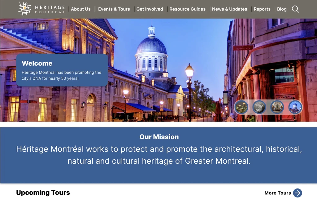
Héritage Montréal is a non profit organization that works to protect and promote the architectural, historical, natural, and cultural heritage of Greater Montreal. They do this by representing Montreal’s unique identity through education and various forms of activism.
Héritage Montréal is a non profit organization that works to protect and promote the architectural, historical, natural, and cultural heritage of Greater Montreal. They do this by representing Montreal’s unique identity through education and various forms of activism.
Project Summary
Project Summary
Initial usability testing revealed that the Heritage Montreal website has a confusing layout, hindering users from easily finding relevant content relevant to their interests. Booking tours is challenging, and the lack of engaging details discourages users from making purchases. Here are the reasons for these issues:
Initial usability testing revealed that the Heritage Montreal website has a confusing layout, hindering users from easily finding relevant content relevant to their interests. Booking tours is challenging, and the lack of engaging details discourages users from making purchases. Here are the reasons for these issues:
A homepage that doesn’t state the purpose of the organization.
Lack of useful content on the tours page to encourage users to buy a tour
Inefficient checkout process for booking a tour
Disorganized information architecture that makes it difficult to navigate through the site.
A homepage that doesn’t state the purpose of the organization.
Lack of useful content on the tours page to encourage users to buy a tour
Inefficient checkout process for booking a tour
Disorganized information architecture that makes it difficult to navigate through the site.
We decided to redesign their website to improve user experience, focusing on one streamlined user flow for purchasing tours and making tour-related content more engaging.
We decided to redesign their website to improve user experience, focusing on one streamlined user flow for purchasing tours and making tour-related content more engaging.
Our Goal
Our Goal
We chose to reorganize and refine how their content is presented so that it is more engaging and streamline the process of buying a tour. By doing so, we want people to interact with heritage sites and be inspired to participate in their preservation.
We chose to reorganize and refine how their content is presented so that it is more engaging and streamline the process of buying a tour. By doing so, we want people to interact with heritage sites and be inspired to participate in their preservation.
Constraints
Constraints
These are the limitations we had to work with.
These are the limitations we had to work with.
Time
Time

We had only 2 weeks to complete our high fidelity prototype. We focused on one user flow, the functionality and visual identity of the website.
We had only 2 weeks to complete our high fidelity prototype. We focused on one user flow, the functionality and visual identity of the website.
Technical limitations
Technical limitations
Desire to build complex features were present but our technical capabilities were limited. Focus was on accessibility, usability, and visual identity of the site.
Desire to build complex features were present but our technical capabilities were limited. Focus was on accessibility, usability, and visual identity of the site.
Access to right users
Access to right users

Would have been nice to have interviewed people who visited the website and booked a tour through it to understand their experience.
Would have been nice to have interviewed people who visited the website and booked a tour through it to understand their experience.
Assumptions
Assumptions
These are what we already held to be true regarding our users and the organization.
These are what we already held to be true regarding our users and the organization.
Population type
Population type
Ages between 25- 40. People are sociable and like to travel. This makes them more likely to search for tours and attend them often.
Ages between 25- 40. People are sociable and like to travel. This makes them more likely to search for tours and attend them often.
Business
Business

Heritage Montreal can provide the in-person experience that is reflective of the anticipation the content we reorganize and refine.
Heritage Montreal can provide the in-person experience that is reflective of the anticipation the content we reorganize and refine.
Culture
Culture

Locals and tourists prefer taking tours that provide them insights about their local heritage as opposed exploring sites on their own .
Locals and tourists prefer taking tours that provide them insights about their local heritage as opposed exploring sites on their own .
Discovery Phase
What is Heritage?
What is Heritage?
Heritage is the expression of a people’s legacy in terms of historical and cultural significance. Tangible markers of heritage can be festivals, food, and architecture. They make cities vibrant and give them a unique identity that tells a story across different generations.
Heritage is the expression of a people’s legacy in terms of historical and cultural significance. Tangible markers of heritage can be festivals, food, and architecture. They make cities vibrant and give them a unique identity that tells a story across different generations.
Why Heritage Montreal?
Why Heritage Montreal?
We chose Héritage Montréal for its focus on preserving the city’s historical architecture, paralleling our view of natural ecosystem preservation. Just as preserving nature benefits humanity, historical architecture fosters human ingenuity. By showcasing this heritage, we can educate potential users about the rich cultural ecosystem of humanity.
We chose Héritage Montréal for its focus on preserving the city’s historical architecture, paralleling our view of natural ecosystem preservation. Just as preserving nature benefits humanity, historical architecture fosters human ingenuity. By showcasing this heritage, we can educate potential users about the rich cultural ecosystem of humanity.

Initial Impressions of the website
1
Homepage

1
2
Inaccessible colour scheme. Yellow background with white text is hard to read.
2
No hero section that introduces the purpose of their website.
Tours page

1
2
2
2
1
The graphics should be clearer, wish they had chunked the information, making it digestible.
There could’ve been another CTA button under the tour description as opposed to a general one for all tours.
Donation page

Nice description that is thought provoking. However, instead of giving a list of reasons why to donate it would be nice to show examples of preservation efforts.
Initial Impressions of the website
1
Homepage
1
2
Inaccessible colour scheme. Yellow background with white text is hard to read for many people.
2
No hero section that introduces the purpose of their website.
Tours page
2
1
2
2
1
The graphics should be clearer, wish they had chunked the information, making it digestible.
There could’ve been another CTA button under the tour description as opposed to a general one for all tours.
Donation page
Nice description that is thought provoking. However, instead of giving a list of reasons why to donate it would be nice to show examples of preservation efforts.
Initial Impressions of the website
Homepage
1
2
1
2
Inaccessible colour scheme. Yellow background with white text is hard to read.
No hero section that introduces the purpose of their website.
Tours page
1
2
2
2
1
The graphics should be clearer, wish they had chunked the information, making it digestible.
There could’ve been another CTA button under the tour description as opposed to a general one for all tours.
Donation page
Nice description that is thought provoking. However, instead of giving a list of reasons why to donate it would be nice to show examples of preservation efforts.
Revealing the Problem
Revealing the Problem
We interviewed 6 people to understand their general attitudes toward heritage sites. Our list of questions stemmed from two high level questions:
When and how did they interact with Heritage sites
How was their experience visiting a Heritage site.
We interviewed 6 people to understand their general attitudes toward heritage sites. Our list of questions stemmed from two high level questions:
When and how did they interact with Heritage sites
How was their experience visiting a Heritage site.
What people said....
What people said....
People said they valued heritage sites but also said learning about them is often difficult and boring.
People said they valued heritage sites but also said learning about them is often difficult and boring.
Value
Value

Appreciative of heritage sites for the unique identity they give to their local cities. They wouldn't mind paying for fun heritage events.
Appreciative of heritage sites for the unique identity they give to their local cities. They wouldn't mind paying for a fun heritage events.
Hesitant
Hesitant
People find it difficult to access information about heritage sites. They don't search for them or encounter heritage related information.
People find it difficult to access information about heritage sites. They don't search for them or encounter heritage related information.
Bored
Bored

Visiting a heritage site and learning about them is not engaging enough. The stories are not memorable for them to go back for another visit.
Visiting a heritage site and learning about them is not engaging enough. The stories are not memorable for them to go back for another visit.
However...
------ Due to the internet, it can't simply be that information about heritage sites is hard to find. Rather, people seem to feel that useful and engaging information about heritage sites is hard to find. --------
“I don’t find useful and engaging information about heritage sites”
“I don’t find useful and engaging information about heritage sites”
“I don’t find useful and engaging information about heritage sites”
“I don’t find useful and engaging information about heritage sites”
“I don’t find it easy to find information about heritage sites.”
Definition
The problem is this...
People find it difficult to acquire intimate and engaging experiences with heritage sites that are memorable enough to inspire them to take part in heritage preservation and understand it’s significance.
People find it difficult to acquire intimate and engaging experiences with heritage sites that are memorable enough to inspire them to take part in heritage preservation and understand it’s significance.
The solution....
How might we provide a user experience where people can find information about heritage sites that is accessible, novel, and insightful, that inspires them to take part in heritage conservation by attending in person events?
How might we provide a user experience where people can find information about heritage sites that is accessible, novel, and insightful, that inspires them to take part in heritage conservation by attending in person events?
Meet Gabriel...
Meet Gabriel...
Now that we knew what people are looking for in regard to heritage sites, we could create a user persona that reflects their needs and goals.
Now that we knew what people are looking for in regard to heritage sites, we could create a user persona that reflects their needs and goals.
Gabriel Bélanger
Gabriel Bélanger

Age : 31
Age : 31
Software Engineer
Software Engineer
Location: Montreal, Quebec
Location: Montreal, Quebec
Apps Used
Apps Used

PhotoShop

Spotify

“The farther backward you can look, the farther forward you are likely to see”
About
Has been an avid history fan since high school. While he’s not at his job or hanging out with friends he is learning about architectural styles he finds fascinating and wants to see them in person. Always looking for an opportunity to travel, he wants to see new places and share his experience on his instagram account.
Needs
A way to find out about more upcoming local heritage related events / tours
A way to support his local heritage sites other then a donation
Wants to be more engaged when attending a tour or an event
Needs to experience the city’s heritage sites in person
Goals
Get more involved with Heritage architecture and preservation efforts.
Attend events and tours at heritage sites with colleagues and friends.
Learn fascinating heritage sites and their history.
Share his experiences on social media and spread awareness.
Frustrations
Gets bored when visiting heritage sites.
Sites become development opportunities instead of living/commercial spaces.
Being unaware of entertaining and edifying events at heritage sites
When visiting hours and events do not line up with his schedule
---Gabriel doesn’t just want to learn about his local heritage sites, he wants to learn about them through an exciting in person experience. What does Héritage Montreal offer that has the potential to accomplish this?
They offer tours.
We set out to redesign how they offer their tours to reflect what someone like Gabriel would look for.---
Ideation
Our User Flow
Our User Flow
Taking the user scenario, we turned it into a user flow. This would be helpful for us create a new information architecture and specify the steps Gabriel will take to book a tour.
Taking the user scenario, we turned it into a user flow. This would be helpful for us create a new information architecture and specify the steps Gabriel will take to book a tour.

What features should our prototype have?
What features should our prototype have?
We looked at similar non-profit organizations that had a competitive advantage. I looked at the various strengths of their features and instead of simply emulating them in our redesign I understood the theme and came up with ways we could implement them in our redesign of the site.
We looked at similar non-profit organizations that had a competitive advantage. I looked at the various strengths of their features and instead of simply emulating them in our redesign I understood the theme and came up with ways we could implement them in our redesign of the site.
Inspiration

Vancouver Heritage Foundation
Vancouver Heritage Foundation
- Wait list for sold out tours
- Gallery of past tours
- Introduce their tours.
- Wait list for sold out tours
- Gallery of past tours
- Introduce their tours.
Themes
General. Introductory.
General. Introductory.
The general and introductory information about the tour should be important and meaningful in helping them decide on a tour.
The general and introductory information about the tour should be important and meaningful in helping them decide on a tour.

Get Your Guide
Get Your Guide
- Has ratings/reviews of tours
- Can purchase a tour as a gift
- Has an itinerary for the tour.
- Reviews of tours
- Can purchase a tour as a gift
- An itinerary for the tour.
Engaging. Informative.
Engaging. Informative.
Details about the tour is insightful and informative in a way that emphasizes the quality of the tour and what people can expect to experience in the tour.
Details about the tour is insightful and informative in a way that emphasizes the quality of the tour and what people can expect to experience in the tour.

GuruWalk
GuruWalk
- Map showing meeting point
- Easy to read visual highlights
- Nice photos in the banner
- Map shows meeting point
- Visual highlights of tour shown
- Photos in the banner
Accessible. Visually Pleasing.
Accessible. Visually Pleasing.
The tour needs to be presented in a visually pleasing manner. It should be easy to browse through them and understand what is being offered.
The tour needs to be presented in a visually pleasing manner. It should be easy to browse through them and understand what is being offered.
Implementation of themes ...
Implementation of themes ...
Now, we not only had some ideas of the features we could implement in our redesigning of the website, but had a better understanding of how the new information architecture should look like.
Now, we not only had some ideas of the features we could implement in our redesigning of the website, but had a better understanding of how the new information architecture should look like.
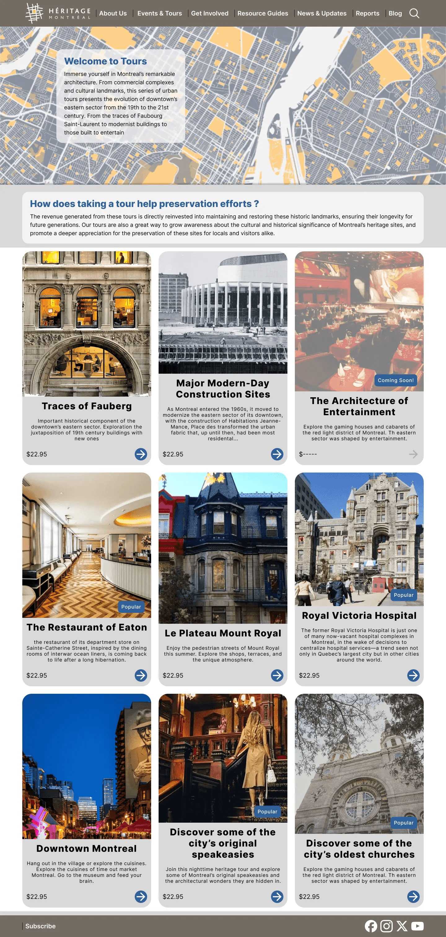
Homepage
Homepage

We will bring tours to the homepage so users will immediatly notice theme. General information will convey the organization's purpose.
We will bring tours to the homepage so users will immediatly notice theme. General information will convey the organization's purpose.
Tours Page
Tours Page

The tours are visually pleasing and have a short description of the tour. Must be easy to browse through the tours and choose one.
The tours are visually pleasing and have a short description of the tour. Must be easy to browse through the tours and choose one.
Tour Content
Tour Content

Description must be Informative. Users must be able to anticipate what they can expect from the tour by reading the description provided.
Description must be Informative. Users must be able to anticipate what they can expect from the tour by reading the details.
Updating our Prototype
Based on the feedback we received, here are some of the most important changes we made to our prototype.
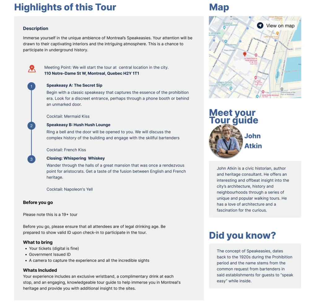
Tour description page
1
3
4
2
1
4
3
2
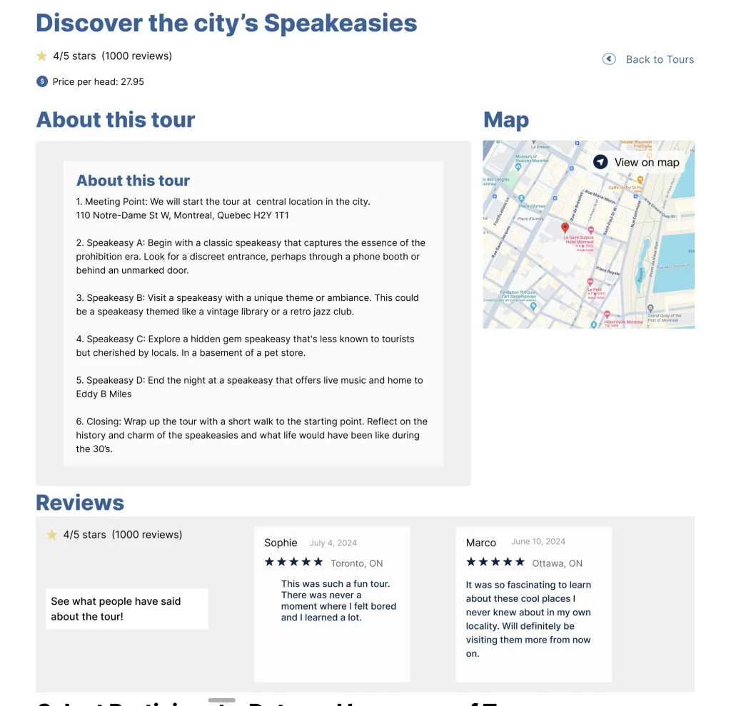
We not only added reviews into the tour description but added a few testimonies as well.
A price per head was added so it’s clear that it is not the cost of the tour itself.
A back button was added so the user can easily go back.
A map of the starting point was added so users can quickly know whether they are close by to the location or not.
1
No confirmation dropdown before fields selected.

Counter intuitive behaviour was fixed by ensuring the drop down confirmation does not show up before all fields are entered.
Confirmation dropdown appears.

Confirmation is only revealed after the users click on ‘Proceed to book’.
Payment details before payment is made.
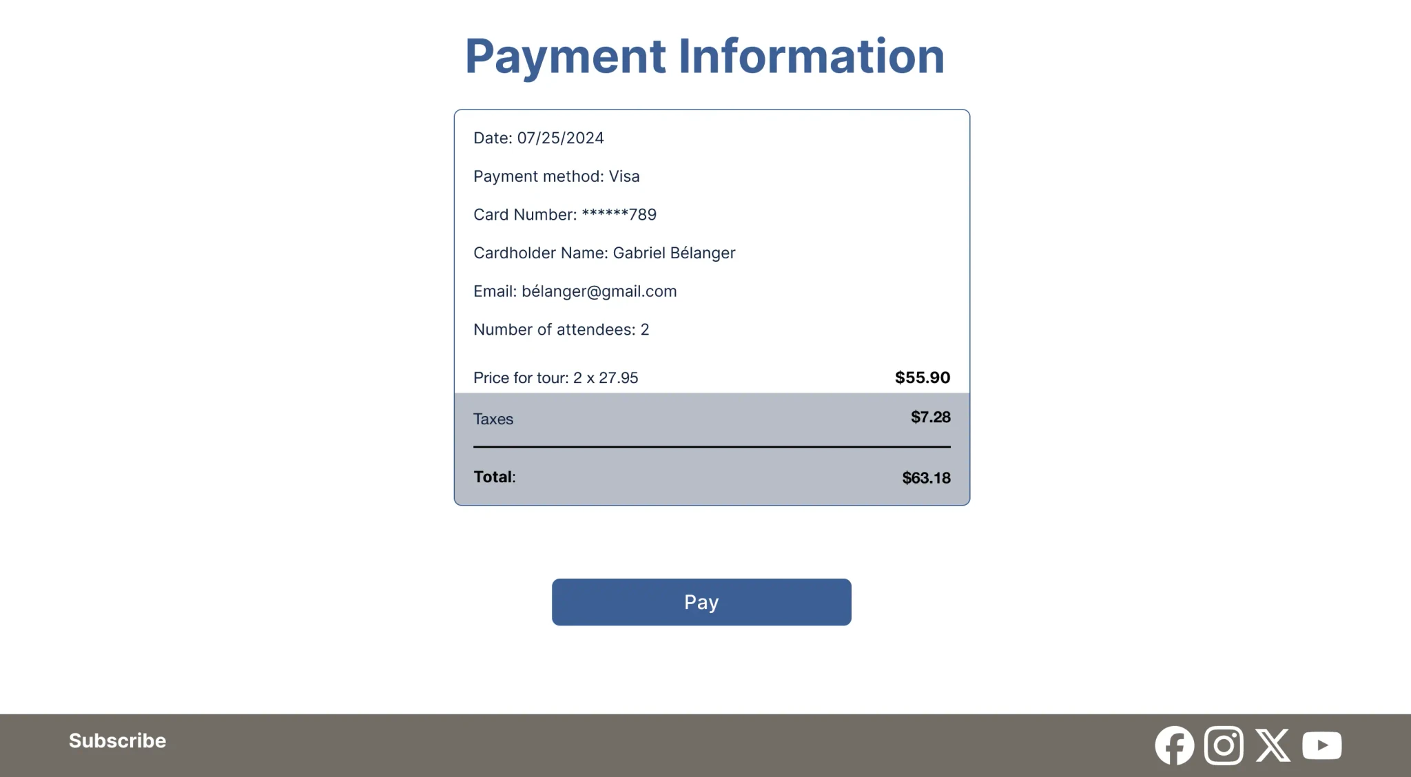
Payment details are shown once again just before a user makes a purchase.
Updating our Prototype
Based on the feedback we received, here are some of the most important changes we made to our prototype.
Tour description page
1
3
4
2
1
We not only added reviews into the tour description but added a few testimonies as well.
A price per head was added so it’s clear that it is not the cost of the tour itself.
A back button was added so the user can easily go back.
A map of the starting point was added so users can quickly know whether they are close by to the location or not.
4
3
2
1
No confirmation dropdown before fields selected.
Counter intuitive behaviour was fixed by ensuring the drop down confirmation does not show up before all fields are entered.
Confirmation dropdown appears.
Confirmation is only revealed after the users click on ‘Proceed to book’.
Payment details before payment is made.
Payment details are shown once again just before a user makes a purchase.
Prototyping and testing
The Wireframe
The Wireframe
Keeping in mind the time, I quickly came up with a rough sketch of what our pages should look like and consulted with my team members to see if the general outline was good enough.
Keeping in mind the time, I quickly came up with a rough sketch of what our pages should look like and consulted with my team members to see if the general outline was good enough.

The Mid Fidelity Prototype
The Mid Fidelity Prototype
We built a prototype based on the wireframe in mind and added substantial detail into our prototype in order to quickly start testing and identify any major issues the user might have with the flow.
We built a prototype based on the wireframe in mind and added substantial detail into our prototype in order to quickly start testing and identify any major issues the user might have with the flow.
Homepage
Homepage

Events and Tours
Events and Tours
Tour description
Tour description

Payment confirmation
Payment confirmation
User Testing Version 1 - Booking a Tour
User Testing Version 1 - Booking a Tour
The focus of this user objective was to understand how easy or difficult it was for users to book a tour. The users were given an objective and 3 tasks to complete.
The focus of this user objective was to understand how easy or difficult it was for users to book a tour. The users were given an objective and 3 tasks to complete.
User Objective
User Objective
User Objective
As a user you would like to attend a heritage tour offered by Heritage Montreal and learn interesting historical facts about the site. The speakeasies tour piques your interest and you decide to book tickets for you and your friend.
As a user you would like to attend a heritage tour offered by Heritage Montreal and learn interesting historical facts about the site. The speakeasies tour piques your interest and you decide to book tickets for you and your friend.
As a user you would like to attend a heritage tour offered by Heritage Montreal and learn interesting historical facts about the site. The speakeasies tour piques your interest and you decide to book tickets for you and your friend.
The Tasks
The Tasks
The Tasks
Find the tour you are interested in.
1. Find the tour you are interested in.
1. Find the tour you are interested in.
Book the tour for you and your friend.
2. Book the tour for you and your friend.
2. Book the tour for you and your friend.
Pay for the tour and your friend.
3. Pay for the tour and your friend.
3. Pay for the tour and your friend.
The Feedback
The Feedback
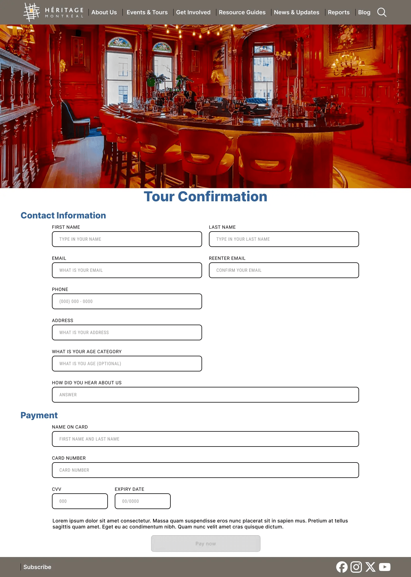
The feedback we received was concerned with the process of booking a tour and paying for it. Video illustrating mistakes shown below as well.
The feedback we received was concerned with the process of booking a tour and paying for it. Video illustrating mistakes shown below as well.
Missing fields
Missing fields

Though meeting point was mentioned it was hard to see. Users wanted to see maps, reviews, the cost per person, and maybe an interesting.
Though meeting point was mentioned it was hard to see. Users wanted to see maps, reviews, the cost per person, and maybe an interesting.
Counter intuitive behaviour
Counter intuitive behaviour

The booking process is not intuitive - the ticket confirmation pops up before all fields selected . No price breakdown before purchase
The booking process is not intuitive - the ticket confirmation pops up before all fields selected . No price breakdown before purchase
Return to previous page.
Return to previous page.

Users searched for a way to go back to the previous page in case if they wanted to change the tour they wanted to book or simply browse whats on offer.
Users sought a way to return to the previous page to change their tour or browse available options.
Updating our Prototype - Version 1
Based on the feedback we received, here are some of the most important changes we made to our prototype.
Tour description page
1
3
4
2
1
4
3
2
We not only added reviews into the tour description but added a few testimonies as well.
A price per head was added so it’s clear that it is not the cost of the tour itself.
A back button was added so the user can easily go back.
A map of the starting point was added so users can quickly know whether they are close by to the location or not.
1
No confirmation dropdown before fields selected.
Counter intuitive behaviour was fixed by ensuring the drop down confirmation does not show up before all fields are entered.
Confirmation dropdown appears.
Confirmation is only revealed after the users click on ‘Proceed to book’.
Payment details before payment is made.
Payment details are shown once again just before a user makes a purchase.
User Testing Version 2 - Usefulness of content
User Testing Version 2 - Usefulness of content
This user objective focused on understanding whether or not they found the content interesting and left them encouraged to book a tour. Hence, we asked questions instead of giving the users tasks to complete.
This user objective focused on understanding whether or not they found the content interesting and left them encouraged to book a tour. Hence, we asked questions instead of giving the users tasks to complete.
User Objective
User Objective
You’re in Montreal for the weekend. As a user you stumble upon the Héritage Montreal’s website and start exploring the website. The ‘Discover the city’s Speakeasies tour’, piques your interest and you want to find out more.
You’re in Montreal for the weekend. As a user you stumble upon the Héritage Montreal’s website and start exploring the website. The ‘Discover the city’s Speakeasies tour’, piques your interest and you want to find out more.
You’re in Montreal for the weekend. As a user you stumble upon the Héritage Montreal’s website and start exploring the website. The ‘Discover the city’s Speakeasies tour’, piques your interest and you want to find out more.
The Questions
The Questions
Can you tell me what the website or organization is about?/ how long did it take you to find out?
Can you tell me what the website or organization is about?/ how long did it take you to find out?
Can you tell me what the website or organization is about?/ how long did it take you to find out?
Can you list anything that you found interesting about the tour description?
Can you list anything that you found interesting about the tour description?
Can you list anything that you found interesting about the tour description?
How did you find the tone and language used in the tour cards and description?
How did you find the tone and language used in the tour cards and description?
How did you find the tone and language used in the tour cards and description?
If you could add one thing to the tour information what would it be?
If you could add one thing to the tour information what would it be?
If you could add one thing to the tour information what would it be?
The Feedback
The Feedback
The responses we received revolved around the content being uninteresting or confusion about the website's purpose.
The responses we received revolved around the content being uninteresting or confusion about the website's purpose.
Purpose of the site
Purpose of the site

Figuring out the purpose of the organization took time because the user spent a few seconds to read through the hero section of the site.
Figuring out the purpose of the organization took time because the user spent a few seconds to read through the hero section of the site.
Creating interest
Creating interest

Users found the Speakeasies tour concept interesting but didn't find the tour interesting. They also didn't find the images visually pleasing.
Users found the Speakeasies tour concept interesting but didn't find the tour interesting. They also didn't find the images visually pleasing.
What's nice to have
What's nice to have
Users said they would like to see an FAQ section, or some images of previous tours. Otherwise, not sure only that it should draw their attention.
Users said they would like to see an FAQ section, or some images of previous tours. Otherwise, not sure only that it should draw their attention.
1
Updating our Prototype - Version 2
Based on the feedback we received, here are some of the most important changes we made to our prototype.
Homepage - Less time to understand purpose of organization
2
Mission statement has been reduced to one line and is made more prominent so users can quickly get an idea of what the organization is about
We reduced the length of the mission statement. Now, it takes less time to understand the purpose of the organization while remaining succinct and precise.
1
2
2
Tours page - Better images and shorter but intriguing copy

1
2
1
2
I reduced the amount of copy the user had to read, instead I made it more intriguing or “enticing” to pique user interest.
Used more visually appealing images that resonate with the mood of what the tour would expore.
Tour information page - Better copy and more useful information
1
2
4
3
3
2
1
Names were added as well as a short but interesting description of the tour.
Even though users didn’t say they wanted to know about the tour guide, we thought adding it would convey a feeling of transparency and make the tour a more intimate experience.
An interesting fact was added to capture the user's interest and keep them engaged.
A section with disclaimers was added. Not only was this an implied request by a user but this kind of information is important for establishing user confidence.
4
Updating our Prototype - Version 2
Based on the feedback we received, here are some of the most important changes we made to our prototype.
Homepage - Less time to understand purpose of organization
2
Mission statement has been reduced to one line and is made more prominent so users can quickly get an idea of what the organization is about
We reduced the length of the mission statement. Now, it takes less time to understand the purpose of the organization while remaining succinct and precise.
1
1
2
1
2
Tours page - Better images and shorter but intriguing copy
1
2
1
2
A similar principle was applied to improving our tours page. I reduced the amount of copy the user had to read, instead I made it more intriguing or “enticing” to pique user interest.
More visually appealing images replaced older ones. This was done to convey a mood that resonates with what the tour would explore. Another way of sparking user interest.
Tour information page - Better copy and more useful information
3
2
1
Names were added as well as a short but interesting description of the tour.
Even though users didn’t say they wanted to know about the tour guide, we thought adding it would convey a feeling of transparency and make the tour a more intimate experience.
An interesting fact was added to capture user interest.
A section with disclaimers was added. Not only was this an implied request by a user but this kind of information is important for establishing user confidence.
4
1
2
3
4
1
Updating our Prototype - Version 2
Based on the feedback we received, here are some of the most important changes we made to our prototype.
Homepage - Less time to understand purpose of organization
2
Mission statement has been reduced to one line and is made more prominent so users can quickly get an idea of what the organization is about
We reduced the length of the mission statement. Now, it takes less time to understand the purpose of the organization while remaining succinct and precise.
1
2
2
Tours page - Better images and shorter but intriguing copy
1
2
1
2
I reduced the amount of copy the user had to read, instead I made it more intriguing or “enticing” to pique user interest.
Used more visually appealing images that resonate with the mood of what the tour would expore.
Tour information page - Better copy and more useful information
1
2
4
3
3
2
1
Names were added as well as a short but interesting description of the tour.
Even though users didn’t say they wanted to know about the tour guide, we thought adding it would convey a feeling of transparency and make the tour a more intimate experience.
An interesting fact was added to capture the user's interest and keep them engaged.
A section with disclaimers was added. Not only was this an implied request by a user but this kind of information is important for establishing user confidence.
4
Visual identity
Mood board and creative direction
Mood board and creative direction
While the purpose of our features was to reflect user needs and the user flow, the visual design was not communicating the site’s identity. This subtracted from the user goals. For example, not understanding how users processed the information on the tour description led to a poor design and several user complaints.
While the purpose of our features was to reflect user needs and the user flow, the visual design was not communicating the site’s identity. This subtracted from the user goals. For example, not understanding how users processed the information on the tour description led to a poor design and several user complaints.
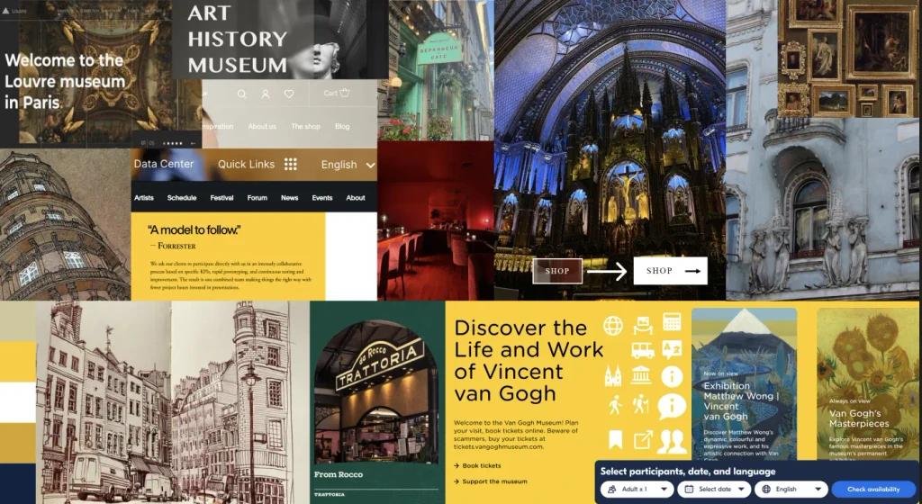
Moodboard
Moodboard
I collected images that reflected these themes and reviewed them with my team.
I collected images that reflected these themes and reviewed them with my team.
Museums
Old architecture
Visually appealing places in Montreal - cafes, churches etc.
Buttons and design layouts for inspiration
Choosing the color scheme
Choosing the color scheme
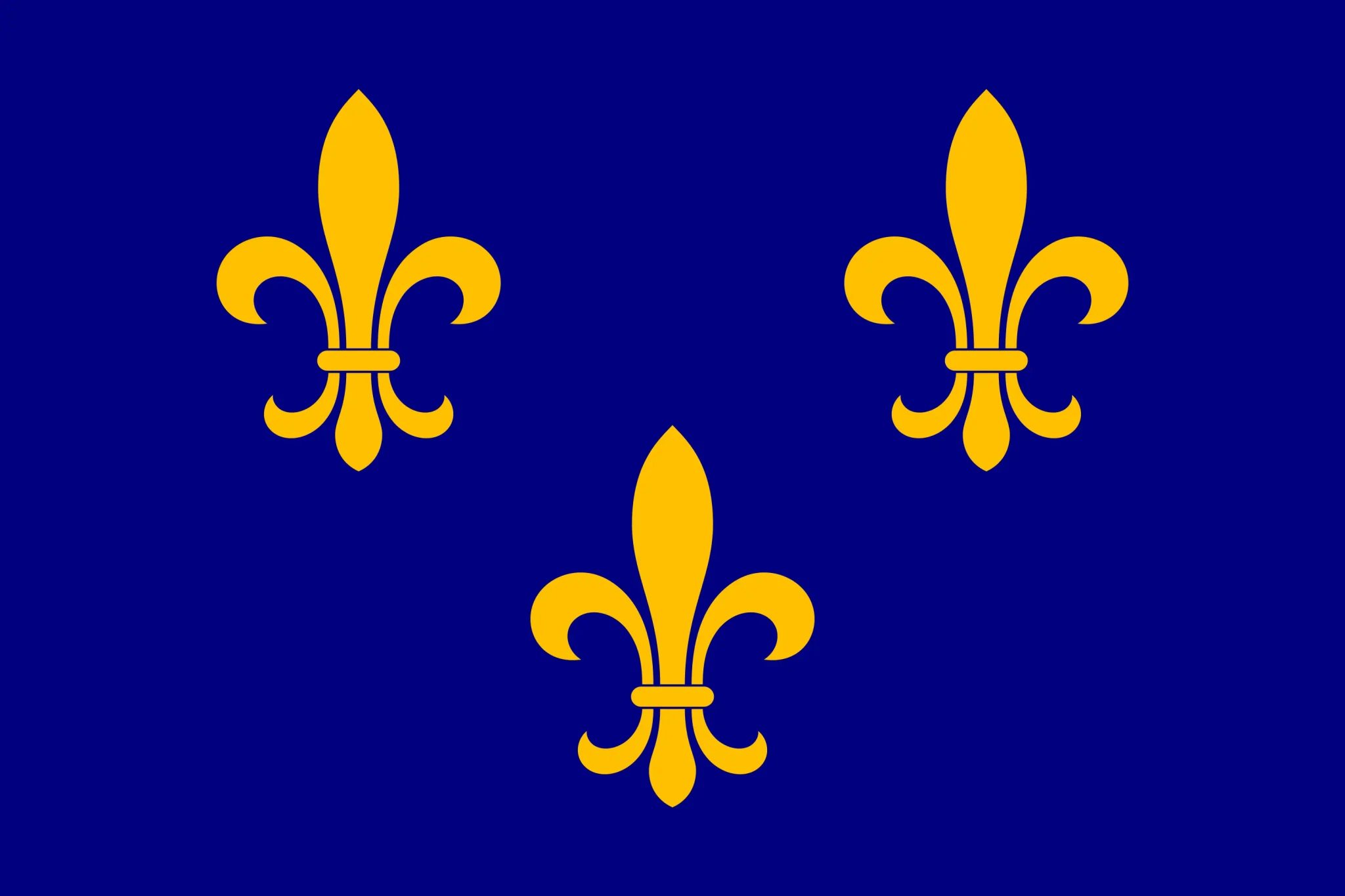
Since we were redesigning an organization that focused on french heritage I began thinking about the ‘fleur-de-lis’ (‘french lily).
Since we were redesigning an organization that focused on french heritage I began thinking about the ‘fleur-de-lis’ (‘french lily).
A symbol used on the traditional coat of arms of France from the Middle Ages and even after the Napoleonic era, has historical significance. The flag is blue and the lilies are yellow.
A symbol used on the traditional coat of arms of France from the Middle Ages and even after the Napoleonic era, has historical significance. The flag is blue and the lilies are yellow.
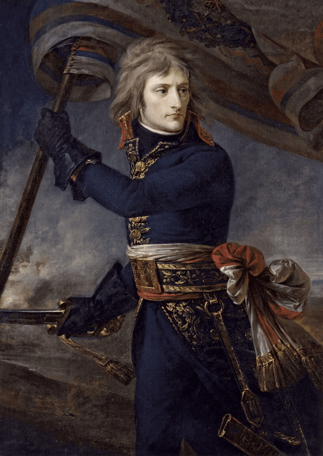
In this painting of Napoleon, arguably the most famous french figure in history, is wearing a navy blue uniform with gold on the lapels and in many instances elsewhere.
In this painting of Napoleon, arguably the most famous french figure in history, is wearing a navy blue uniform with gold on the lapels and in many instances elsewhere.
In my mind, the consistent use of these colours was associated with french history and heritage.
In my mind, the consistent use of these colours was associated with french history and heritage.
Brand colors
Hex code: 0C2340
Hex code: FFCB04
Accent color
Hex code: D8A31A
Neutral colors
Hex code: FFFFFF
Hex code: F0D283
The muted orange supplements the navy blue but brings a somber tone thats ideal for mission statements. The white and beige balances the darker tones so they’re not overbearing on the user’s eyes.
The muted orange supplements the navy blue but brings a somber tone thats ideal for mission statements. The white and beige balances the darker tones so they’re not overbearing on the user’s eyes.
The Typography
The Typography
I began to think of some adjectives that are associated with the concept ‘French heritage’; but found it too broad. So, I narrowed it down to a related concept, ‘old architecture’. Here is what I came up with.
I began to think of some adjectives that are associated with the concept ‘French heritage’; but found it too broad. So, I narrowed it down to a related concept, ‘old architecture’. Here is what I came up with.
Elegance
Grandeur
Classic
Captivating
I decided on a font pairing that would reflect these adjectives and showed them to my team.
EB Garamond: Promoting the city’s DNA for over 50 years
Helvetica Neue: Heritage Montreal works to protect and promote the architectural, historical, natural, and cultural heritage of Greater Montreal.
I decided on a font pairing that would reflect these adjectives and showed them to my team.
EB Garamond: Promoting the city’s DNA for over 50 years
Helvetica Neue: Heritage Montreal works to protect and promote the architectural, historical, natural, and cultural heritage of Greater Montreal.
Testing schemes..
Testing schemes..
Unsure of how the new typography and the colour scheme I chose would look on our redesign, I started to put together some sample screens and visual elements to see which ones looked the best.
Unsure of how the new typography and the colour scheme I chose would look on our redesign, I started to put together some sample screens and visual elements to see which ones looked the best.


Text and Background
Text and Background
I ensured that colours and text I chose were accessible and visually pleasing and in line with the organization's identity.
I ensured that colours and text I chose were accessible and visually pleasing and in line with the organization's identity.
UPCOMING EVENTS
Immerse yourself in the heart of Montreal.
UPCOMING EVENTS
Immerse yourself in the heart of Montreal.
Cards and other visual elements
Cards and other visual elements
The cards and other visual elements conveyed key information. A visual hierarchy that emphasizes this being designed and iterated over.
The cards and other visual elements conveyed key information. A visual hierarchy that emphasizes this being designed and iterated over.

Old Montreal
Walk through the cobbled streets of from Notre Dame to the old Harbor
22.95 $
Old Montreal
Walk through the cobbled streets of from Notre Dame to the old Harbor
22.95 $
Sophie
July 4, 2024

Toronto, ON
Lorem ipsum dolor sit amet consectetur. At pretium urna risus nec nulla penatibus. Nisl fusce est bibendum enim morbi eleifend quis. Nisl fusce est bibendum enim morbi eleifend quis.
Hi-Fidelity Prototype And Conclusion
The High - Fidelity Prototype
The High - Fidelity Prototype
With our colour scheme, visual elements in place, and redesigned pages in place, we completed a high fidelity prototype, building on the visual language we had established at the beginning of the protoyping phase.
With our colour scheme, visual elements in place, and redesigned pages in place, we completed a high fidelity prototype, building on the visual language we had established at the beginning of the protoyping phase.
Here are some important updates we made to our final prototype
Clear and concise communication of important information presented throughout the website
Elevated visual identity that helps the user navigate the website and establish it’s authenticity
Went beyond user expectations to enrich the user experience (e.g tour payment confirmation before and after purchase, tour guide information, sold out tour statuses)
Future Opportunities
Future Opportunities
While we accomplished so much, here are the useful features that could be added in the future to enhance the user experience.
While we accomplished so much, here are the useful features that could be added in the future to enhance the user experience.
Become a member
Become a member

Develop a feature flow enabling people to participate and become a member of the organization. Also, make it quick and easy.
Develop a feature flow enabling people to participate and become a member of the organization. Also, make it quick and easy.
Personal features
Personal features

Add account creation where people can see their profile details. download their tickets for their tours, save pages they have visited.
Add account creation where people can see their profile details. download their tickets for their tours, save pages they have visited.
Interactive map and points
Interactive map and points
People could get points based on the tours they've visited. Also, they could tell others stuff they found at interesting at a site by pointing out on a map.
People could get points based on the tours they visited. They could tell others stuff they found at interesting at a site by pointing it out on a map.
People can get points based on the tours they visited. They could tell friends things they found interesting at a site by pointing it out on a map.
My Learnings
My Learnings
I learned that communication is key to overcoming challenges as a team, testing provides valuable insights, and I should be bolder in my design decisions.
I learned that communication is key to overcoming challenges as a team, testing provides valuable insights, and I should be bolder in my design decisions.
Be confident
Be confident
Trust your decisions, be outspoken, always review your work. This enables myself to be more confident with my insights and designs.
Trust your decisions, be outspoken, always review your work. This enables myself to be more confident with my insights and designs.
Liase and cooperate
Liase and cooperate
Cooperation, being receptive to critique, and communication were quintessential to overcoming challenging hurdles.
Keep testing
Keep testing

Test often and fast. Every iteration brings me closer to a polished product that fulfills user needs because it gives me valuable insights.
Test often and fast. Every iteration brings me closer to a polished product that fulfills user needs because it gives me valuable insights.
I am still learning when to use my accents in French…
The end
I am still learning when to use my accents in French…
The end
I am still learning when to use my accents in French…
The end
Made with Figma and Framer
Made with Figma and Framer